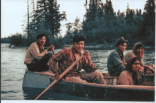
While the site was down for the migration from vBulletin to Xenforo plus customization for a week at the end of August 2021, I gave a lot of thought and effort to what I wanted to do, if anything, with the site logo/picture.
Originally, the site had a picture of Willis Brown's canoe, which carried over to Robin's tenure as administrator. Robin tried a few different logos and pictures over the years, ending up with the black & white pencil sketched paddler with a logo inscribed on birchbark. This B&W pencil sketch continued on through the administrative tenures of dougd and DaveO, so I decided I would stay with it as being sort of an established tradition.
However, I thought the pencil sketch was a little too monochromatic, washed out and lacking in contrast. Here it is, as it was:

I wanted to make it "pop" more, and to be more compatible with the multiple color themes I was planning for the site. So, I played with my long-expired Picasa photo editor and found that I could colorize the birch bark logo and add contrast while retaining the black and white character of the paddler. I also rounded the corners of the picture, reduced its vertical height a bit, put a thin white border around the photo, and embedded it all in a rectangular black frame that would be compatible with the four site color themes I had in mind. And that's what's now atop the site.

But then my wife asked a question. What's going on with that once-white birch bark that makes it now red, orange, yellow and white—while the paddler is in a black & white landscape? She wanted an interpretive explanation. A story.
I have three interpretations (the first being my wife's):
1. It is fall. The leaves on the trees are a brilliant red, orange and yellow. A beautiful orange-red sunset is filtering through the leaves and colorizing the birch bark. The canoeist then goes out for a moonlight paddle.
2. The canoeist has used the birch bark as tinder to start a camp fire, and the red, orange, yellow and white flames are licking around it. The canoeist then goes out for a moonlight paddle.
3. The canoeist is a girl. About 12 years old. Her name is Dorothy. And she is paddling from the Kansas of vBulletin toward the Oz of Xenforo.
Originally, the site had a picture of Willis Brown's canoe, which carried over to Robin's tenure as administrator. Robin tried a few different logos and pictures over the years, ending up with the black & white pencil sketched paddler with a logo inscribed on birchbark. This B&W pencil sketch continued on through the administrative tenures of dougd and DaveO, so I decided I would stay with it as being sort of an established tradition.
However, I thought the pencil sketch was a little too monochromatic, washed out and lacking in contrast. Here it is, as it was:

I wanted to make it "pop" more, and to be more compatible with the multiple color themes I was planning for the site. So, I played with my long-expired Picasa photo editor and found that I could colorize the birch bark logo and add contrast while retaining the black and white character of the paddler. I also rounded the corners of the picture, reduced its vertical height a bit, put a thin white border around the photo, and embedded it all in a rectangular black frame that would be compatible with the four site color themes I had in mind. And that's what's now atop the site.

But then my wife asked a question. What's going on with that once-white birch bark that makes it now red, orange, yellow and white—while the paddler is in a black & white landscape? She wanted an interpretive explanation. A story.
I have three interpretations (the first being my wife's):
1. It is fall. The leaves on the trees are a brilliant red, orange and yellow. A beautiful orange-red sunset is filtering through the leaves and colorizing the birch bark. The canoeist then goes out for a moonlight paddle.
2. The canoeist has used the birch bark as tinder to start a camp fire, and the red, orange, yellow and white flames are licking around it. The canoeist then goes out for a moonlight paddle.
3. The canoeist is a girl. About 12 years old. Her name is Dorothy. And she is paddling from the Kansas of vBulletin toward the Oz of Xenforo.


