• Happy Winter Solstice! 🌇🌃

WA Fisher Maps misprints?

Joined
Oct 10, 2022
Messages
500
Reaction score
1,305
Location
New England
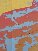
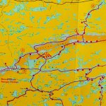
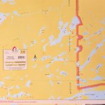
I recently ordered some WA Fisher Maps for Quetico Provincial Park and received one that is misprinted, or at least that's what I'd call it, and wondered if it's a one-off problem. The misprint appears to be an error in the scaling of the shaded border along the Quetico boundary and makes it difficult to read details of the map, let alone how distracting it is, especially when aligned with the adjacent maps. Anyone else received a map like this? I'm going to request a correct copy from the retailer but thought I'd ask here to know if a correct copy has been/is available.

The specific map is F-28 Beaverhouse, Cirrus, and Quetico Lakes
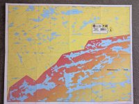
WA Fisher Map F-28 misprint.jpg

WA Fisher Map F-28 detail.jpg
 
Last edited:
Here's a shot of the Cirrus Lake area on the overview map showing the boundary shading I mentioned and a portion of map F-26 showing how the boundary is typically shaded on the individual maps. Online images of older printings of F-28 show a similar shading. So it appears the edition of map F-28 I purchased was misprinted. Hopefully I can get a corrected printing, or at least an older version.

Cirrus lake area of overview map:

Cirrus Lake area map misprint-1.jpg

And here's a section of F-26 with the boundary shading at the correct scale:

Comparison map boundary shading-1-1.jpg
 
Last edited:
Well, I got a reply from the retailer and this is what he told me about the new W A Fisher maps...

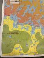
"This year W A Fisher made the decision to change the aesthetic of their maps. ... sometime this spring they started shipping us these newly updated maps... which have more bold colors than the previous versions. (I deleted sections that would indicate the retailer.)

On some of these maps, I think the coloring makes sense and enhances readability (see attached image of map F-17). Here, they have used yellow for USA/BW, Dark Orange/Red for Quetico/CN, and lighten the Quetico side so that only the area right on the border is dark, getting lighter as you go inland. When PMAs are present, they highlight those in green to clearly differentiate the boundaries.

According to Fisher when
[we] reached out to inquire, they did this to differentiate the border. Previously, both Quetico and BW were yellow and the border was not bold enough to easily differentiate, ....

Long story short, it’s not an error, but an intentional choice by Fisher and the scheme they will pursue moving forward."


F17 Crooked Lake BWCA and Quetico.jpg

That's unfortunate in my opinion. I think the new coloring scheme is much more difficult to read, especially the blue on dark orange in Quetico, and was unnecessary. If some people were having trouble seeing the boundaries, they perhaps need to refine their map reading skills. That's assuming that these maps, although "not for navigation", do get used that way by many canoeists. I think the yellow backing color scheme is a good one for that reason. It's too bad because they're otherwise great maps. But that's my opinion and I'm not selling maps, so it goes.

As an alternative, these GoTrekkers topographic maps look promising and come in 1/50,000 = 2.0 cm/km (1.27 in/mi) scale water resistant maps. It means I'll have to add campsite and portage information and that was the main reason I purchased the W A Fisher maps. The other thing I like about the Fisher maps is the scale being 1/42,240 = 1.5 in/mi (2.37 cm/km), which, except for the new color scheme, makes it a bit easier to see small details. But for me, being able to easily see water features on the GoTrekkers NRCAN maps overrides the scaling advantage of the Fisher maps.
 
Last edited:
Back
Top Bottom