-
Happy Publication of Dickens' "A Christmas Carol" (1843)! 😠👻🩼🎄
You are using an out of date browser. It may not display this or other websites correctly.
You should upgrade or use an alternative browser.
You should upgrade or use an alternative browser.
New Graphics at Hemlock Canoe?
- Thread starter M Clemens
- Start date
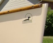
I remember talking to Matt around the time they were making the change a few months ago and he said it was difficult to use the complex logo in social media and marketing, and that the simpler logo made it a lot easier.
Personally, I find the new stuff a bit cartoonish and really thought the old one was very classy looking, even though the new one harkens back to the even older Curtis heritage. The SRT is on my short list for my next solo and I’m hoping they would still be able to do the old Hemlock logo. Just my personal preference.
Personally, I find the new stuff a bit cartoonish and really thought the old one was very classy looking, even though the new one harkens back to the even older Curtis heritage. The SRT is on my short list for my next solo and I’m hoping they would still be able to do the old Hemlock logo. Just my personal preference.
Have to agree. Glad for the continuation of the company but if I buy from them again I would ask for no logo…the old design was much classier.
I too think the new logo is not as attractive. Are there smaller words under the "HEMLOCK" on the side?
Perhaps when he gets enough feedback he will rethink the change. I always thought the Hemlock logo was one of the classiest.
- Joined
- Nov 30, 2017
- Messages
- 1,094
- Reaction score
- 3,033
I gotta say that from an aesthetic point of view, or from a commercial advertising pov, that's just awful.
If they can’t, I have for sale a white SRT that has never seen water, one of the last boats built by Dave. I purchased it as a backup when it looked like Dave might close shop. It has the style of stickers that Dave was using the last couple of years. Boat is in Maine, but shipping probably is about the same as a boat direct from Hemlock, unless you were going to make the trip to pick it up.I remember talking to Matt around the time they were making the change a few months ago and he said it was difficult to use the complex logo in social media and marketing, and that the simpler logo made it a lot easier.
Personally, I find the new stuff a bit cartoonish and really thought the old one was very classy looking, even though the new one harkens back to the even older Curtis heritage. The SRT is on my short list for my next solo and I’m hoping they would still be able to do the old Hemlock logo. Just my personal preference.
If they can’t, I have for sale a white SRT that has never seen water, one of the last boats built by Dave. I purchased it as a backup when it looked like Dave might close shop. It has the style of stickers that Dave was using the last couple of years. Boat is in Maine, but shipping probably is about the same as a boat direct from Hemlock, unless you were going to make the trip to pick it up.
Thank you, truly, but if I end up picking the SRT it will likely be a custom job. One of the cool things about a small shop like Hemlock is their flexibility. I’ve had some conversations with them and they’ve seemed willing to change their layups slightly for me which is a big selling point. Portaging isn’t really done where I’m located, but shallow sections of gravel wear bottoms out fast. I would be happy to trade some weight savings for a boat that will be more abrasion resistant. Most places won’t do that, but they’ve been open to slightly increasing the gel coat layer a few mils, adding layers/partials of heavier weight s-glass in key areas, etc. which is really cool. I’m also very interested in their potential new innegra layup. Hopefully that flexibility means they’ll also still do the old logo as well.
And of course vastly more important than any performance consideration, I’m absolutely enamored with their sage and blue spruce colors, so it will have to be one of those two, with the two tone/white bottom, not that I’ve given it much thought


